So you finished an awesome blog post.
You’ve shared it on social media. You got some promising engagement and good feedback but now you’re ready for the next step -- it’s time to turn that article into a killer slideshow.
What’s the point?
The first reason is that you’ll expand your article’s reach and grow your audience.
Slideshare -- where you’ll be uploading your finished product -- is trusted by 70 million professionals as a resource to quickly learn about specific topics. People post their slideshows and visual walkthroughs and get plenty of traffic as a result. If you’re not on Slideshare, you’re missing a valuable opportunity to promote your articles and build your brand.
Second, Slideshare tends to rank incredibly well in search results and it looks professional to boot. The fact that Slideshare is owned by LinkedIn doesn’t hurt either.
As if that’s not enough, I’ll show you how you can use your slideshow to direct more traffic back to your original article and your website. Win-win-win.
Here’s how to turn your article into a slideshow:
First, head on over to Canva.com and sign up.
Canva is an incredible platform for ANYTHING relating to online design. I use it to make slideshows, infographics, Twitter images and custom Pinterest graphics -- the list goes on. It makes me feel like I’m a real designer.
Once you’re on the main screen, click Presentation.
Now choose one of the free layouts on the side. Every “paid” element will cost you a dollar, but there are TONS of amazing free layouts and images if you don’t want to pay a dime.
Once you pick a free layout that you like, it’s time to start messing with it to make it your own. Drag and drop a new image into the upload section. (Here is a great resource for finding free awesome images.) Change the text to make it your title. Change the font or color if you want. Do whatever floats your boat.
A QUICK TIP: Click on your image and click Filter to give your image a little something extra.
ANOTHER QUICK TIP: To make your image much darker like I did -- so that your white words can really pop -- just add a black square over your image. Then change the transparency until it’s just the way you like it. Do this with a white square and black text to get the opposite effect.
While I was working, I got inspired and decided to switch some things around. I added a new square on the top and bottom to frame the image. Then I changed the color and font of the text and added two little rectangles around CHALLENGE to emphasize it. It’s amazing what you can do with those shapes.
Once you’re happy with your cover page, it’s time to move on.
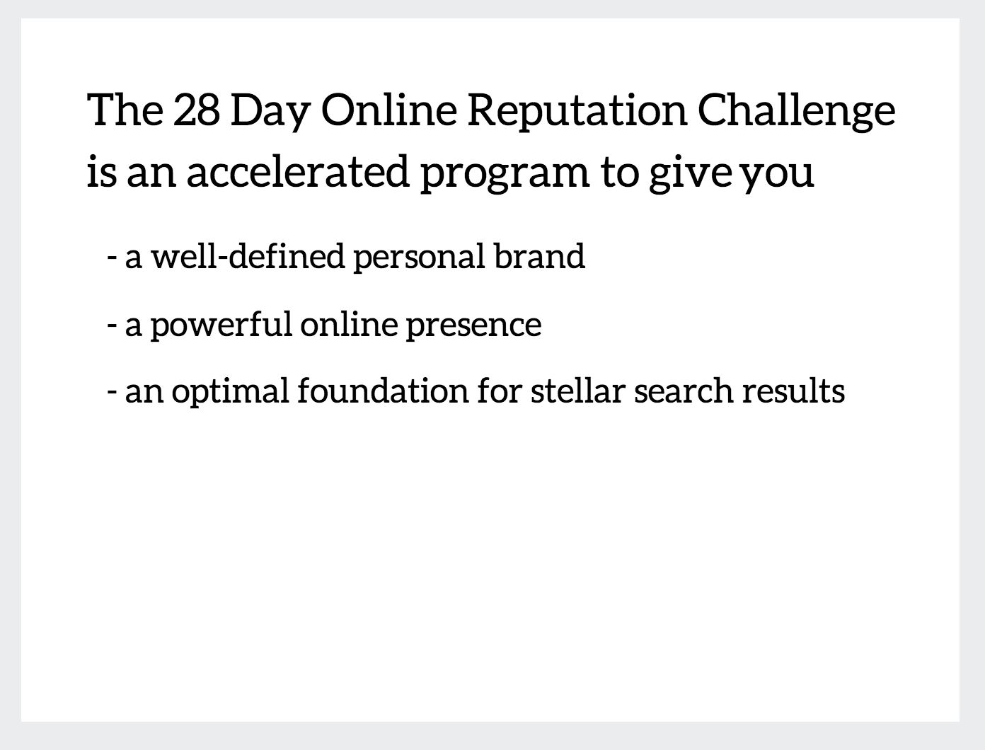
Figure out how to distill your article down to a few key points. If you’re stuck, try using 2-3 slides to set up the problem, another 4-6 to make your point, and 1-2 slides to conclude.
First, add a textbox and copy the first key piece of your article. Do not be afraid of white space. It’s simpler for you and tends to look better anyway.
Brighten things up with some colors, selective bolding, and some of Canva’s icons.
Once you’ve figured out a font size and font type, stick to it. Copy one of your existing text boxes and paste it in your next page to keep things consistent. Add an image for some visual appeal.
I like to search for free vector images -- like the one above -- so I can use them against any background color. For this one, I simply Googled “fitness vector image.” Then I clicked Images → Search Tools → Usage Rights and changed it to “labeled for reuse” to avoid any copyright issues.
Try making a few points visually in one slide with the help of some vector images or Canva’s own icons. You can even use their Frames feature to auto-split your slide in various ways.
I like to alternate between slides that force my audience to focus and slides that let them breathe.
Canva has a Charts section, which makes it really easy to showcase numbers and datasets visually.
Here’s another slide to let viewers catch their breath.
If you find it useful, take advantage of Canva’s stylized, pre-designed fonts in the Text tab. And don’t forget about their free icons and images!
Once you’ve figured out a slide style, it makes sense to use it again when appropriate.
And again.
And again!
It’s worth noting here that I used a small trick on my Week 2 slide. I made one slide look like this (without the winky face at the bottom) and copied it using the copy button on the side.
After I copied it, I then added the note at the bottom.
This adds a cool effect. When someone clicks to the next slide, it looks like a little message popped up. Neat, right?
Moving on…
If you can offer your audience enough info to make your slideshow useful -- and still leave them wanting to read the rest of your article or go to your website, that’s a huge win.
I always recommend some sort of call-to-action, typically with a link to your website.
Export your slideshow as a PDF (standard) and you’re good to go.
Now go and upload it to Slideshare. Make sure to fill in the title, an engaging description, a relevant category, and plenty of keywords to increase discoverability.
You can check out my final product here.
And that’s it -- congratulations! Leave me a comment or tweet me at @ryanerskineNY if you have any questions.


